Posts

Shot sizes and angles

Image
This extreme wide shot is from the film mad max and was shot via a go pro and it includes a lot of intense detail around him and the car with the sandy desert . Here is an extreme close up of Comic book character Magneto, in the film X-men Apocalypse. Extreme Close ups are usually used for showing emotions on a persons face.    This medium shot was taken from the film ted, but really it was just a shot of actor Mark Whalberg (left) and then a cgi character on the right. This is an extreme long shot in the film Star Wars Empire Strikes Back where they have probably taken a picture of space and then cropped in an edited picture of this star destroyer. 

Colours

Image
In this session, I got the chance to go out into the city of bath and find specific colours according to the colour wheel that I was given. The results were great! I found a lot of nice examples. there were a lot of brand colours that really caught my eye so I snapped them. The whole idea was to match the colours of the colour wheel and make that type of thing to your own accord in InDesign. So that's what I did and this is my result: I like my work because I have Cyan and a loud red                                                  My idea was to use the colours outside and turn it into a colour wheel, but not just any colour wheel. A different style, so to make one that fades the colours rather than has an immediate change to them. Also, you may notice that it goes down instead of a circle. I do know how but I thought that I could exper...

What is GAMUT?

WHAT IS GAMUT? Gamut is the full range of something, so what it actually means is the full range of colours in this case. It is a useful term in the world of colour to describe all the 16.8 million different variations. In colour reproduction, including computer graphics and photography, the gamut, or the colour gamut is a certain complete subset of colour. The most common usage refers to the subset of colours which can be accurately represented in a given circumstance, such as within a given colour space or perhaps by a certain output device.

Colours of generation

Image
Colours of the 70's The colours of the 70's would be more vibrant colours. They represent the more experimental stage that we went through. The previous 60's had blander colours where they were just introduced to an explosion of colour. Although the 70's dimmed down into more darker colours. The 60's introduced the colourful fashion that we have today. The retro fashion in the present day has come back, and has become the more appealing to wear lighter colours created by big brands. There are a lot of people if you go out and see, that they will wear something of a light colour. The 60's helped us to understand everything that colour has introduced to the world. The happy colour were made popular and the sadder and darker colours are less used because they represent emotions. The tactic was, to make everyone happy by making a lot of brighter colours for example: Blue, red, green and yellow etc.

Survey

Image
In my useful postcard survey, I sadly found out that no-one pays any interest in postcards any more. I found this out in a particular survey question where I said: And as you can clearly see, it says: would you buy a postcard? and everyone said no. So I came to the conclusion that no-one like postcards anymore. And the only reason they would, would be for fun. This made me think about why the people of Bath don't like postcards and the simple answer is time. What I mean is that, technology has progressed so much over time that it has grown old fashioned to write a postcard. Obviously, now you can do it via text and so the former way of sending a message has been abandoned.

Type and layout

Image
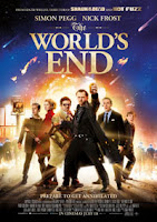
Type and layout The Worlds End's poster uses the Ascender font which is a very clear and elegant font. It uses more natural curves and straight lines to its counter part Descender:  Descender is used in the recent 2010 film Robo-cop. It's counter part (Ascender) uses natural curves and straight lines whereas, Descender uses less elegant lines but a more bold half attempted curve that really makes it look modern and I like it a lot more than Ascender.  The Cover for withering heights uses X-heights. This is a more bold font that is noticeable and perfect for posters. Especially if you get a colour that makes it stand out. This is easy to read and you Don't need to look hard and think about the letter(s). As is the case with the next up serif: As used in the Titanic remake poster, the font Serif is used. It is like Ascender in such a way that it uses more natural curves and is a more old fashioned font. This remind...