Type and layout
Type and layout
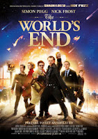
The Worlds End's poster uses the Ascender font which is a very clear and elegant font. It uses more natural curves and straight lines to its counter part Descender:
Descender is used in the recent 2010 film Robo-cop. It's counter part (Ascender) uses natural curves and straight lines whereas, Descender uses less elegant lines but a more bold half attempted curve that really makes it look modern and I like it a lot more than Ascender.
The Cover for withering heights uses X-heights. This is a more bold font that is noticeable and perfect for posters. Especially if you get a colour that makes it stand out. This is easy to read and you Don't need to look hard and think about the letter(s). As is the case with the next up serif:
As used in the Titanic remake poster, the font Serif is used. It is like Ascender in such a way that it uses more natural curves and is a more old fashioned font. This reminds me of Roman Times because of the letter's shapes.
This horror movie inside's poster font is called ligature. It is a more basic and straight forward- easy to read font that stands out well.
 These are all types of various font that I haven't covered because there are no movie titles to represent them with
Kerning, Leading and Tracking
In typography, letter-spacing, also called tracking, refers to the amount of space between a group of letters to affect density in a line or block of text. Letter-spacing can be confused with kerning. Letter-spacing refers to the overall spacing of a word or block of text affecting its overall density and texture.
In typography, leading refers to the distance between the baselines of successive lines of type. The term originated in the days of hand-typesetting, when thin strips of lead were inserted into the forms to increase the vertical distance between lines of type.


Comments
Post a Comment