Posts

Showing posts from December, 2016

Shot list

Scene 1: Estb. Of coll. Sweep of kid behind keyboard (past/future) shoulder shot 4x medium of kids cut away to keyboard. cut to phone close up of I (past) meium of kid on CPU shoulder of I Medium of Tobie Shoulder of tobie (medium of I and Ash) medium of ash long shoulder between ash and I Long sweep cut to phone (past) clicks download (future) asks to answer so close up of tobie close to I to medium follow close up of I Sweep of I medium of I cuts call Close up I to cut away of phone Into CPU room = long medium of Ash shoulder of both 3x medium of Convo (Past) still downloading Medium of CPU (future) cuts to ext long of finding the `M-V Scene 2: medium sweep 'hello' long Follow cut of M-V Long Scene 3: Medium of convo Shoulder between both Medium sweep of convo cuts to throat (past) files completed secures them and then carries on to future sweep (future) follow long to medium of walking behind shoulder of M-V long quick of ent

Final design

Image
This is my final Christmas card design that I did myself. I got images of the lion(ess), cub, nativity picture and wood burner from the internet but they were all bright and original. that's until I come along with all of that editing. I did 97% of the work here. The whole light of God is all me using the burn and dodge tool in photoshop. Also as I promised a font that would be jazzy. I also have a font here that is kind of wacky and so takes the mic a bit of the serious picture. I love my final design and the inner of my card is as so:

Animation Reviews - Steve

Glass and water This mini - animation is about a glass who is being watched in the dish washer and then he deliberately steps out of the way so that he doesn't get fully washed with water. This was a very strange film since all you hear is the other glasses singing and then the other foley noises added. I feel as if this was strange because there wasn't much point to it. The fact it had no talking made it difficult to understand what the point was and so therefore lacked to communicate to the audience. Yes the animation was good but the plot was poor. I did like the way the water was painted and this was all drawn. That takes a certain skill. But again, I didn't really get the gist of that. 1936 colour classic This was a nice little animation that was made in 1936 and that was a very good demonstration of how to make an animation. The best thing about that was the fact it had the fact that some of that was 3D. In those time they didn't have computers so the firs

Steve - My life

Image
This is the one of me when I went to my first game in Manchester to watch my team play. This has been a major event in my life since it has shaped how I have life. It has impacted my passion for sport, fitness and activities massively. This effect many types of aspects about me invluding physical appearance. I find that this will be more than suitable to include in my story

C.C Ideas

Image
This is a little idea for the christmas card I want to make. This isn't on the brief but I felt I needed to get an understanding for the design I will do.

Font terms worksheet - Jo

Image

Screen recording - Jo

This is a screen recording of me installing a font of which i might use for my christmas card. This is a useful trick for future use.

Research key terms worksheet - Jo

Image
Please note that the definitions for market research and secondary research are wrong. The correct answer is to swap the answers.

Focus Group

This is my focus group: This is my focus group, we debated how we liked christmas cards and what we want on them. This is useful information for designing a card. Since we are designing one this is useful to the process. I found that everyone liked the abnormal. We have a taste not for the original and traditional colours, but for the more brighter and more of a experimentation approach colours. I think that the best way to make a christmas card is to base it on your target audience. young children want icons in their favourite colours and then for teens up to 18, they will want to have more basic colours with a simple message. then adults up to 65 would accept a more complex design and better art that's humorous. And finally the older people will want the traditional stuff. Standard white, green and red. we also found that there is a wide range of us that have maturity in our preferred style, for example, some of us like bright pink sparkly things as some of us prefer

Christmas card ideas

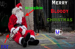
Drunk santa 'merry bloody christmas' A mug as follows with ' U MUG' 'have a good one' snowflakes complex font for ' merry b.c' Fat santa - 'don't end up like him' emoji

Market Research - Jo

Image
85% of christmas cards are bought by women and that means only 15% are bought by men. I will make something that appeals to women In the 19th century, the Post Office delivered cards on christmas day in the UK. Postmen were often known as robins because of their bright their bright red uniforms and robins became a popular christmas card motif. Therefore I will include an animal factor to try and link religion and the animals.  This card is of a couple of penguins that are obviously in love or something like that, and I think that because of the font, the design and the maturity of this that you'd send this to one one your parents or both. The font is nice an its quite jazzy. Probably something like what I want to use. Complex but simple meaning legible. The 'Special Couple' bit I mean. I love the design art of the penguins it give the card maturity to the card. It has a lot of pizzaz of which I'm going to need for my card with this market research. It also doesn