Posts

Showing posts from February, 2017

How to Draw.

There was a video was shown to class today, that pointed out and gave useful facts about how to draw. For example, use basic lines and match them up was a simple but effective explanation. This helped me to calm down about not being able to draw. I also like how I took this and used it to make a couple of shapes and things like pens, T-Shirts etc. This was a very useful tip to someone who is like me and then uses the excuse of "I can't draw" and make me believe.

Shape Tweens

Image
SHAPES : In this fun and short animation I made, with a man that turns into shapes and colours, I had a lot of fun, but it was really educational. I liked the Shape Tween since this is another thing I've learnt in Adobe Animate. The essence of this was to create a moving shape that forms onto another. using colours, this helped the animation because it kept it interesting instead of just the one colour, red. NAME : The one above, is another animation of my name. But, this time I have used shape tweens to move my head emoji into my name. This way was quicker and not just because of the way it's quicker, but it was a lot more fun to do. The technique is simpler and therefore easier. This made it more enjoyable. In my final animation, I have made my name from parts of my face. I really like the way it changes and forms into my letters of my name. it falls perfectly and creates a nice example of the shape tween genre.

Music Video - Love & Theft

At the start, there was an element of foley where, when the shapes got thicker in an appearing shape the louder the sound and then it took off and we saw iconic faces of animation characters (eg. Spider-Man, Micky Mouse, SpongeBob etc.) that were all turning, twisting and even forming into another's face. They repeated 3 times each and then a bull switched the characters faces. Then they changed colours to blue, black and red. This then appeared to be very weird, but when they all had been repeated about 10 times, it went back to the thicker shape the louder the noise, which then turned into them all joining together for the end.

Facebook game

In this game we played as a class, The point of it was to sit or stand around a bit and peel off a piece of your plate that someone has previously drawn for you, of yourself. I thrived at this and the object of the game was to have the most amount of paper left. There was an announcer who asks you questions on your page, that is then to test the players.

The Ark - Animaton

In this film called the Ark, there is a troubled man at the start who finds out he has a disease. Through the film, he walks out through this big freighter that holds many people like him. We know that because there was a nurse at the start caring for a patient, which seems like the ships medical centre when he keeps walking past them so in effect he was in, not a mental home, but a mental ship.  He holds this gun and walks through the ship like he knows where he is going. This could be because he has done it before. I don't know whether he has dementia or not but he definitely has something. I felt like this film was depressing. This was all grey, dark and very gloomy which gave away that this is not a happy film. In the end, he is on the top of a building and is going to do the same thing again. he has a gun in his hand but when he puts it in the tray as an old man it's a door knob. The animation was great, the characters moved with a flow and there was not a single bi

Scrap book art

Image
In today's lesson, I had a go at making a scrapbook: Above is my attempt ar scrapbooking, I thought it was a fun interactive task. Although, I didn't find it something that I'd do every day. I liked the task because the origami and the stamps were fun. I thought it was fun since the origami was something I used to love to do, I think this is why I enjoyed it. On the other hand, the stamps were a chilled out task that was nice to do for the final task considering that the first took a lot of effort. The cutting and the sticking was not the most fun of a task. 

Scrapbooks definition

Scrapbooks are incredibly creative versions of notebooks.

Animated Name

Image
The first one is in photoshop and the second is from animate. In my animation, I mixed up the letters from my surname and from the first as well. I like my animation also because there is smooth motion that eases into place and is easy on the eye.

Typeface Print letter name

Image
This is my print letter for my name. I would like to point out that I really like the first G is my favourite design because it has so much intricate detail that really helps start the name. The N is also really cool because it has a simple outline but an interesting and complex inside that helps it stand out. The letters are mostly all in line. The ascenders are out of line because of the letters overall shape and design, but the X-Height for each word is also the same as the ascender, out of line because of the shape. This leaves the baseline apart from the first G all in line.  

Royal Baby Advert

In this task, we were asked to design an advert for a car sponsor for the new Royal baby.  This was a fun task because we learnt how fast you have to be in the news business. Overall it took Nissan 7 minutes to design an advert for the new royal baby of which they got tonnes of free advertisement for it, it took us 10! Land Rover are the official Royalty car sponsor so we took that idea and made the ROYAL RANGE ROVER. We also added a slogan at the bottom saying; 'Used to transport the Monarchy'.This was a seller in our minds especially because Range Rover is a premium car.

How I did sound

I recorded my sound using a Rode video mic.  It is assembled by sliding the top square on the bottom onto the silver slide on the top of a DSLR and then you twist the circle on top of the sliding part and tighten it. Now take the dangling wire and open the left rubber hatch on the DSLR and plug the AUX cord onto the slot that has the 'Headphones' symbol and voila!! you have then got one thing to do before your ready to go! You must turn it on by sliding the white button up and press record on the DSLR and you are going!!! I used a Rode Video mic because it was the only mic on offer but I found it a very good and reliable piece of equipment. I loved using it because it was so basic and overall brilliant at recording sound! The was no jumps it got everything it could and so therefore  it is a very good piece of filming equipment!

Annotated script

Zach: Really good, liked the way you balanced the serious and funny side of the story. I like how it also had a few dark moments that kept me engaged. The teacher is strict but funny in a way because a the end off the day he's mad at him for going to the toilet!! This was then led onto more funny things like 'I's cockiness and lines that he says. In particular when he got thrown to the floor by the assassin he relies "What?! is that a threat?" he took the mick and then got slapped which had a really funny touch. Emily: I thought that the acting was great and the part was Ieuan is interrogated by the Assassin (George) was great. I liked Ashley's part because the link Ieuan to have a funny and friendly side as well as a kid hacker. The script was great. I like a couple of the one liners in there. Especially the one at the end, "Dinner is served" that was funny. There was a bit of comedy in there, this was important for a serious film. Sam:

Concept art

Image

Storyboard

Image

Evaluation of instagram

Image
First of all, I am going to start with explaining how my page did. I succeeded in achieving my goal in by that I intended to get at least 3-5 followers and 7-9 likes (Avg). And hey! I did it. I am proud of this. My feedback given to me by Jo and Gemma was to have a nice logo that stands out and also to have an iconic (nice) background in every photo. I completed this task by thinking hard about where I was going to go to get that iconic and nice background by going to the famous Victoria park, a lovely lake in the park and finally skate park that everyone uses in the whole city. These are iconic to the world and tho the people of Bath. I like how they turned out but I did originally have a plan to go to the Royal Cresent bu the photo was blurry and I didn't want to include that sort of quality on my page, it could let it down. Through this project, I have learned that there is a whole lot more to Instagram than I originally thought. I think this because I found out that

2.3 - How it did.

Image
In my 1 day of assessing my new account, I have watched the photos grow to be very much liked. I saw that everyone else who used the hashtag bc alt bath spread their photos publishing over a week as I released all mine over practically 10 minutes and it got more likes than I thought it would. I love how it turned out because actually I did a little math and as it turns out I am well up there with the likes in the hashtag section.  If you click on the #bcaltbath hashtag in blue then you'll see. The photo that did the best was the one of me jumping without my hood up. I think people liked that because that was the last one I posted and so, therefore, they saw me be revealed since you couldn't see my face in all of them except that one. I don't think it would have done that well if it had been posted first. I think that the fact it was a revealed one made it most liked. Runner up: In the same place as the revealer one, except this one was heavily modified in photoshop and

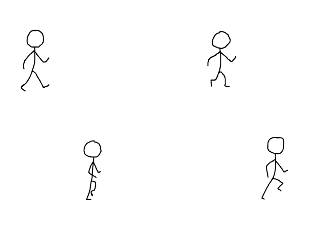
Walking man animation

Image

CPR - simple design

Image

5 simple drawings

Image

Creato - Project for creation

Image
This is me design called Creato. This is a simple toy for kids suitable for the age of 5+. It is a tad complicated but it is definitely fun to play with when you get the hang of it.  You basically have to connect the hook that is magnetised to the iron which receives the hook and if its not stable of needs extra design you can add a rubber strap to the mix.

Being creative - Off Book

We were showed a youtube video that was about how to be creative. It was interesting because they had artist telling us how to come up with new ideas. One of which I really took to mind was where it was explained that you have to go out and get those ideas and that they aren't sat there in front of you all the time. Whether that mean't you had to go out to the country for a relaxing walk and take in inspirations  that were surrounding you, or simply thinking of something entirely different and then something will 'come out of the blue'. This would mean that although you want ideas they don't come easy. It's a matter of patience and perseverance. If something doesn't work then you have to let it go. Don't become attached to ideas, which I found quite informative.

The real thing

https://www.youtube.com/watch?v=3BnP_rulwac

Reflection On UNKNOWN

In my movie (Caller Unknown) I have really put a lot of effort into this. I feel that it has the perfect balance between funny and serious. With the help of fantastic acting by Ieuan Potten who plays the main character 'I', I was enabled to have a great movie because of his extremely good performance. I feel as though that scene when he walks form the doors around to Ash his friend after taking the call, he did that in 1 TAKE!! that was a lot of lines and i'm proud to have had such skill in my favour. In the scene where he is on the computer. These are flashbacks that he has from downloading the files so the audience are then intrigued as to what he is doing. We find out at the end and also earlier on in the movie when he says "finally, government files" we know these are flash backs. I understand how some of the audio echoes in the fight scene but that simply could not be helped. But apart from that I think it did quite well. Especially the music. The music i

Instagram Logo

Image

Theme strategy

Image
GOALS: This (Above) represents the few basic of how to properly prepare an Instagram post. I think that hashtags are as said key to the way people will view your post and how many people will see it. This ladder represents the stages of how I will do my work. I plan to do everything once my account is set up or as soon as. This should hopefully be in a couple of weeks. I need to make a logo for my account because this might just help people to understand what my account is about. I think that it will need to be a modern logo and original. By that, I mean that this could be a bright coloured, transparent and a stylish font.  In my project, I will need to include a good background to capture the audience's attention as well as striking them self with me jumping in the centre of the screen.  I would like to include the original factor so perhaps I will try not to edit it too much by taking away the colour etc. Another goal of mine would be to get 7-9 lik